How to Choose the Right Grout Color for Your Tiles
|
|
Time to read 8 min
|
|
Time to read 8 min
Updated September 2024
You’ve planned your renovation to the T, you’ve chosen the perfect new tiles for your design, and now you’re ready to install them. You might not know it, but there’s still one big question you need to answer - what grout color should you use? The color of your grout has an enormous impact - it can drastically transform the look and feel of an entire room. The good news is there's a color suited for every situation— and best of all, deciding on the right grout shade will ensure a finished product you’ll love for years to come!
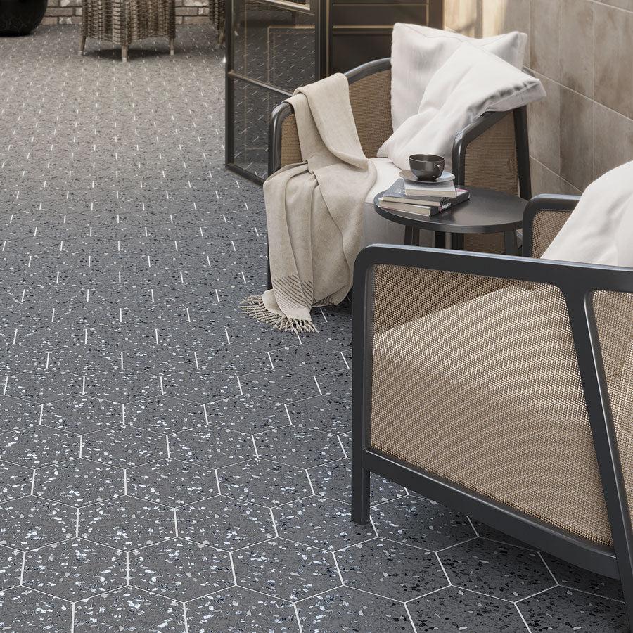
Outlining the Graphite Gray Terrazzo Hex Porcelain Tile with white grout really makes each piece stand out—at the same time amplifying its texture and adding dimension to this restaurant floor and wall!
Grout in simple, neutral shades works with most tile colors. Black, gray, and white are classic options, but other colors like beige, brown, tan, blue, and mossy green are frequently used. A whole rainbow of bright hues and even sparkly options like gold and silver are also available, so there’s a color that will certainly coordinate with your desired finish.
While there aren’t any hard and fast rules, there are a few things to consider when deciding what grout color to use. Keep reading to fill in the gaps!
Grout is important for a number of valuable benefits. To start with, it keeps dirt and debris from collecting between tiles or moisture from seeping into the substrate by acting as a sealant. In addition, grout adds both flexibility and strength, ensuring your tile installation is secure. Grout lines help keep tiles from rubbing together over time as buildings settle. Lack of grout joints - or ones that are not the right size for your chosen tiles - can cause them to crack and chip from use.
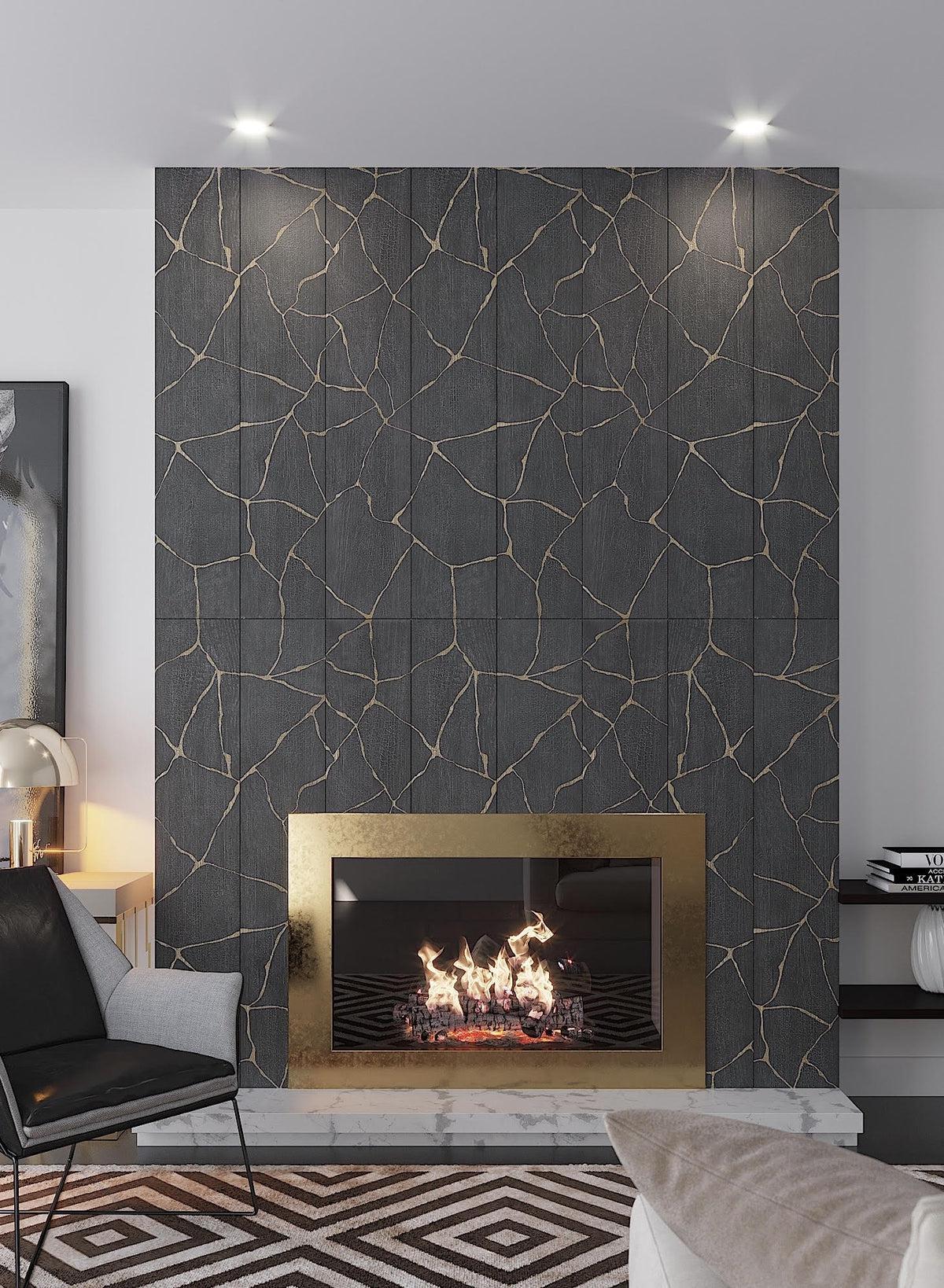
Here, dark grout has been used to unify all the different pieces into one whole and create a striking yet softer look with our Kasai Notte Kintsugi Porcelain Tile. Going for tone on tone with your grout and tile can create a seamless look for a large-scale installation.
Aesthetically speaking, grout is essential for shaping the mood of a room. Ultimately, much of the finished look is determined by whether you’d prefer a grout color that closely matches your selected tile for a seamless installation or delivers striking contrast that adds structure and definition to the room.
Although there is a huge color range on offer, you just need to consider these few approaches to narrow down what does and doesn’t make your heart sing:
The grout color you choose to accompany your tile can have a huge influence on the look you hope to achieve. Knowing possible tile and grout color combinations and the resulting looks is important—but since design is really a matter of preference, knowing where your taste falls is the ultimate factor in determining the direction of your tiling project.
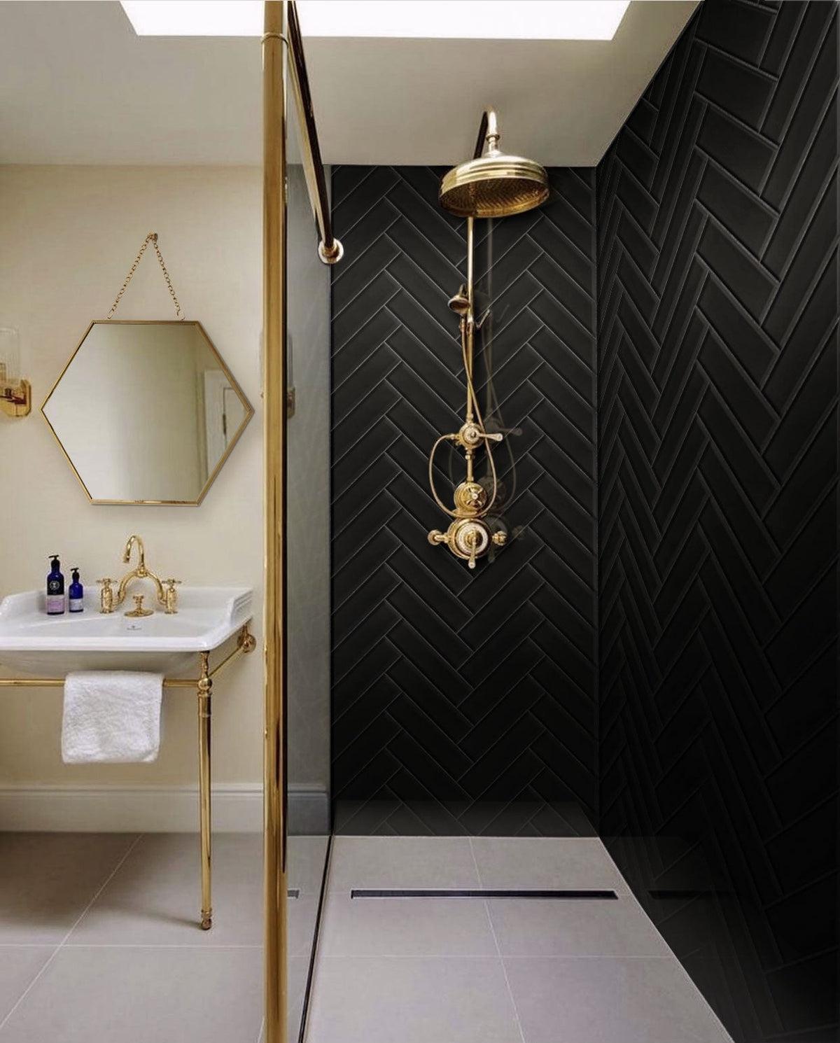
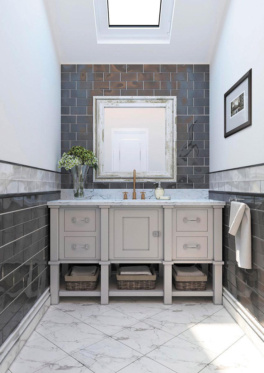
Pairing dark grout with Glacier Black Glass Subway Tile makes the edges look less sharp, resulting in a polished, contemporary finish that’s perfect for just about any bathroom setting. The dark shower wall provides a rich and saturated finish that allows the gold fixtures to pop even more.
For example, if you fancy a polished, contemporary look, you can go for a grout color that blends in with your tile work. But if your tile is laid out in a mosaic that isn’t simple square or straight lines and you want to accentuate its pattern, contrasting grout is probably the best option, as it will boldly outline the design. But is the contrast too intense? Will it fit in with the rest of the rooms’ elements? Taking these factors into consideration as well as your sense of style will help you identify the color that stands out the most to you and meets your sensibility.
When planning your tile layout, it might come as a surprise that the grout color you opt for can do wonders to alter the perception of any room. Choosing a grout color that blends into your tile makes all the pieces feel connected, resulting in a room that appears quite expansive and open.
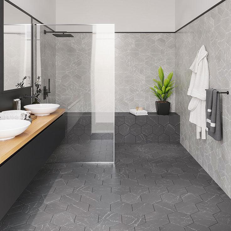
The Cosmo Black Marbled Porcelain Hexagon Tile paired with dark grout is a brilliant example of how matching grout and tile color can give an impression of a spacious room.
For example, coordinating white kitchen floor tiles with white grout creates uninterrupted lines and helps the room feel light and wider. On the other hand, contrasting grout makes the room feel more active and full—which works especially well if you’re looking to make a large space seem cozier. Otherwise, matching or complementing colors are nearly always better in visually expanding a compact room.
Choosing a matching grout color allows it to blend in with the tile, minimizing the visibility of the tile joints and giving off the illusion of a solid surface. With this approach, your selected tile can be as bold or understated as you like—whether through a striking color, veining, or a textured finish, the effect of matching grout and tile color will be a clean and uniform one. For example, white tile and white grout, red tile and red grout, black tile and black grout will result in a breathable, seamless finish that keeps the focus on the tiles themselves.
Matching grout and tile color work brilliantly in all settings, from the most traditional to modern and contemporary. Here, matching grout color has been used to seamlessly blend in with our La Riviera Blue Reef Ceramic Subway Tile. Check out the same design with bright white grout for a different look!
Not sold on matching grout to your tile color? Opting for a strong contrast to the tile can create a bold, dynamic look and make the tile layout or pattern more apparent. This approach works best if you want to add visual complexity to your design and make your tile more of an eye-catching feature.
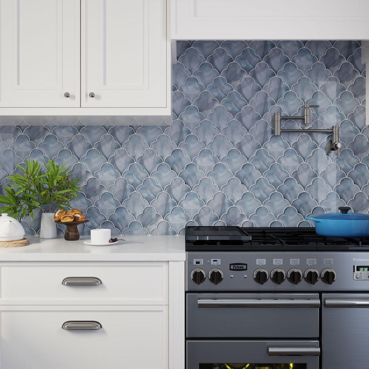
See how your eye picks up the Sea Glass Cloud pattern! White grout adds the perfect contrast that makes this stunning tile shape more pronounced. Wondering which color to use? Tile Club uses Laticrete Bright White grout for most of our in-house installations.
For instance, dark grout will give a defined edge to light tiles and lighter grout will highlight dark tiles more (black and white is a classic version of this and works especially well to give a bold, geometric look to subway tiles). If you’re unsure about which color to use for contrast when dealing with a multi-color tile, try to match the grout to one of the tones in the tile for a cohesive look that doesn’t overwhelm your space.
Bear in mind that a contrasting color can emphasize both the grout lines and tile size - if you’re looking to reduce visual clutter, a complementing grout color might be the way to go.
Outlining Glacier Ash Gray Glass Tile with white grout adds depth and extra dimension, creating a clear definition around each piece. Contrasting grout is a classic choice for colored subway tiles, as it clearly delineates the chosen tile layout.
Because neutral grout might seem like the safest choice, it’s a perennial favorite among homeowners and designers alike. Colors like tan, beige, gray, or cream complement most tiles beautifully—adding just the right hint of color as a matching tone or as graphic as a contrasting shade. What’s more, neutral grout delivers a subdued look that never seems to age the room, even years down the road when you decide to switch up your décor.
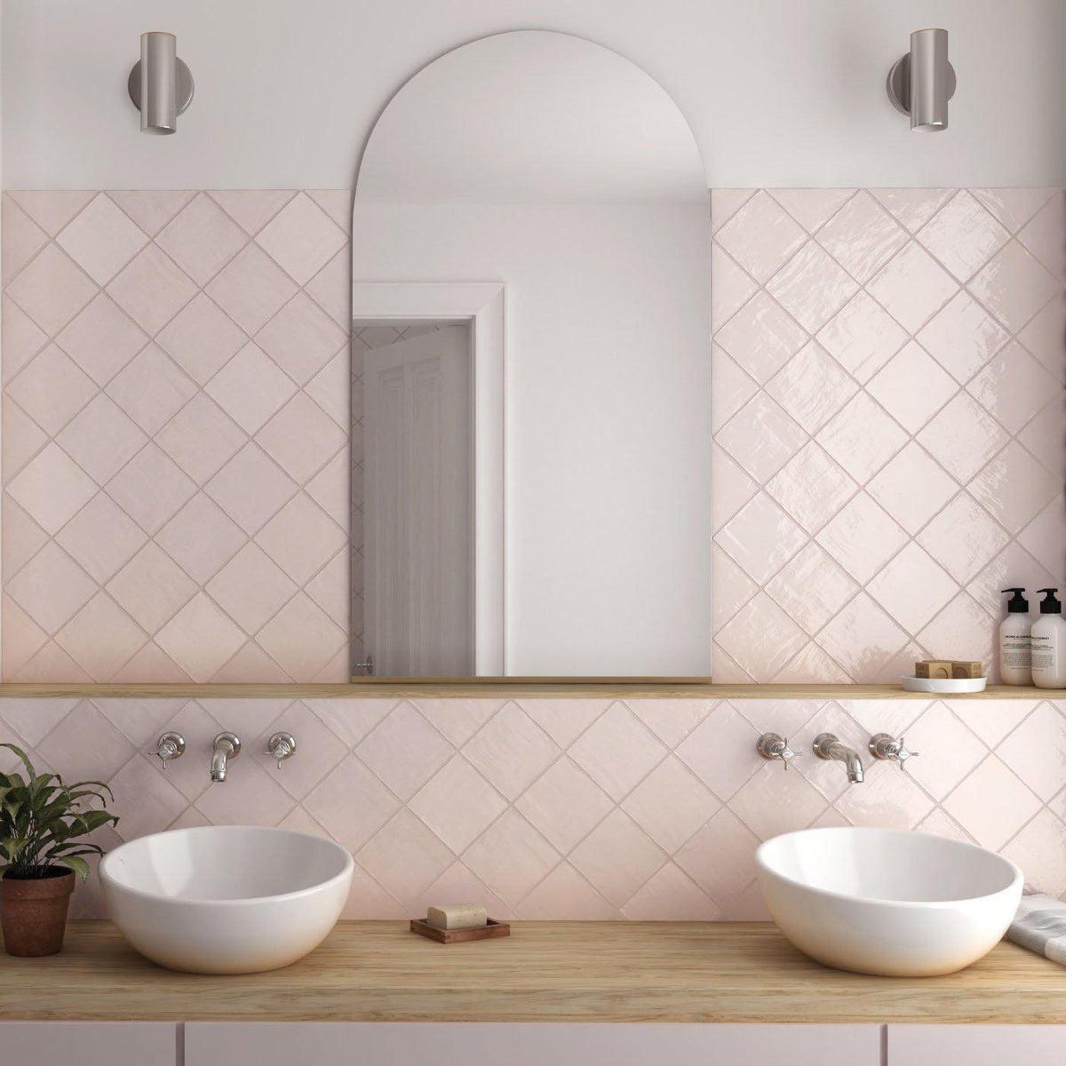
A complementary shade that blends as closely to the tile as possible is great when using smaller tiles so as not to overwhelm the space, as seen here with our La Riviera Rose Pink Ceramic Square Tile. The diamond layout and soft taupe grout color create a chic and warm bathroom backsplash design.
Whether you are matching, complementing, or contrasting, it’s important to look at your tile and study its undertone. If you select a tile with a warm undertone such as orange-red, warm khaki, or creamy white, you will want a grout color that also reads warm. The same goes for tile that features a cool undertone—it is best accompanied by a cool grout color. You can hold up a sample of your tile against a white piece of paper to figure out its undertone.
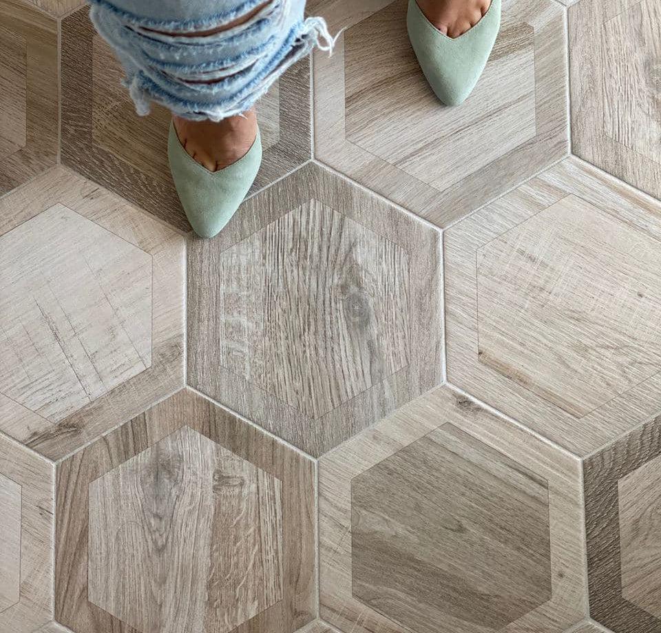
Neutral grout that’s a shade lighter than the Esagona Intarcio Silver Wood-Look Tile unifies each piece for looks ranging from transitional to contemporary and everything in between.
Just like you want to create a test layout before you apply your adhesive, you want to create a grout swatch before you apply it to your tiles. This is an essential step to ensure you like the finished look of your installation!
The best way to test it is to apply your chosen grout color to a small section of your tile. This could be a sample card or a corner of your installation. Choose somewhere out of the way but with good lighting to get an accurate read on how the two materials look together. Our preferred grout manufacturer, Laticrete, even offers grout samples and custom colors!
Choosing the best grout color for your project should involve a fair amount of assessment of how you’ll be using your space. Ease of use and cleaning—particularly on floors where dirt builds up quickly—should be taken into consideration. Dark grout makes dirt more difficult to see and therefore might be a practical choice for high-traffic areas. If you do decide to remain true to your light color palette, sealing the grout is always a great idea to prevent stains and make maintenance simpler.
Check out our guide on how to seal and maintain your grout!
Check out the impact grout color can have!
One tile - two grout colors. Would you choose Diamond Black Glass Mosaic tile with Bright White or Raven grout?
Once a boring basic, grout choices have moved way beyond white versus off-white and can make a world of difference when thinking through your design goals. When selected carefully, grout hue can transform the plainest tile into something glamorous and equally allow a strong pattern to take center stage. Check out more grout and sealant options from our recommendations!
